
Case study
Sustainable Economies
From a merger question to a brand system a small team runs on its own.
Client
Sustainable Economies, Ohio
Services
Workshop facilitation, brand strategy, identity, color and type, pattern system, templates, Canva kit, social, motion
Timeline
December 2025 to 2026
Sector
Conservation, public sector, community economics
The question
A firm that outgrew its look
Sustainable Economies helps public agencies, conservation groups, and community organizations across Ohio make complex decisions with clear data. Then it merged with Springboard Communications and added brand strategy and communications to its services.
The old identity was professional and traditional. The new firm needed to look like it could do creative work, without losing the trust it had built on rigor.
Listening first
We started with a workshop, not sketches
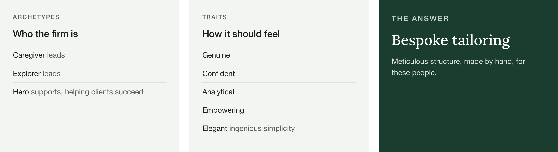
Brand Robear facilitated a December session with the partners to name who the firm is, who it serves, and how it should feel.
The workshop set the archetypes: Caregiver and Explorer lead, with Hero in a supporting role that helps clients succeed. It set five traits: genuine, confident, analytical, empowering, elegant. Elegant here means ingenious simplicity, not ornament.
It also surfaced the real tension. The brand needed to signal precision and courage without performing old-school authority, and warmth without reading as soft. We named the answer "bespoke tailoring": meticulous structure, made by hand, for these people. Every design decision after this traces back to that phrase.
From insight to form
A trillium, in six shapes
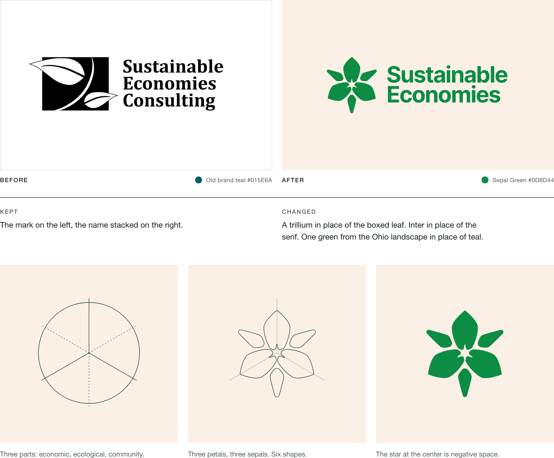
The partners knew what they wanted to keep: the mark on the left and the name stacked on the right. They also knew what wasn't working. The plant sat inside a rectangle that added nothing, and it could have been any plant, anywhere.
They asked us to look at native Ohio plants, and we chose the trillium. The large white trillium is Ohio's state wildflower, and conservation practitioners recognize it on sight. Its three-part form carries the idea at the center of the firm's work: economic, ecological, and community systems that only thrive together.
Pointed sepals give the mark structure. Rounded petals give it warmth. That is bespoke tailoring in six shapes. The star at the center is negative space. The mark holds up at 32 pixels and at 80 inches.
Color with reasons
A palette from the Ohio landscape
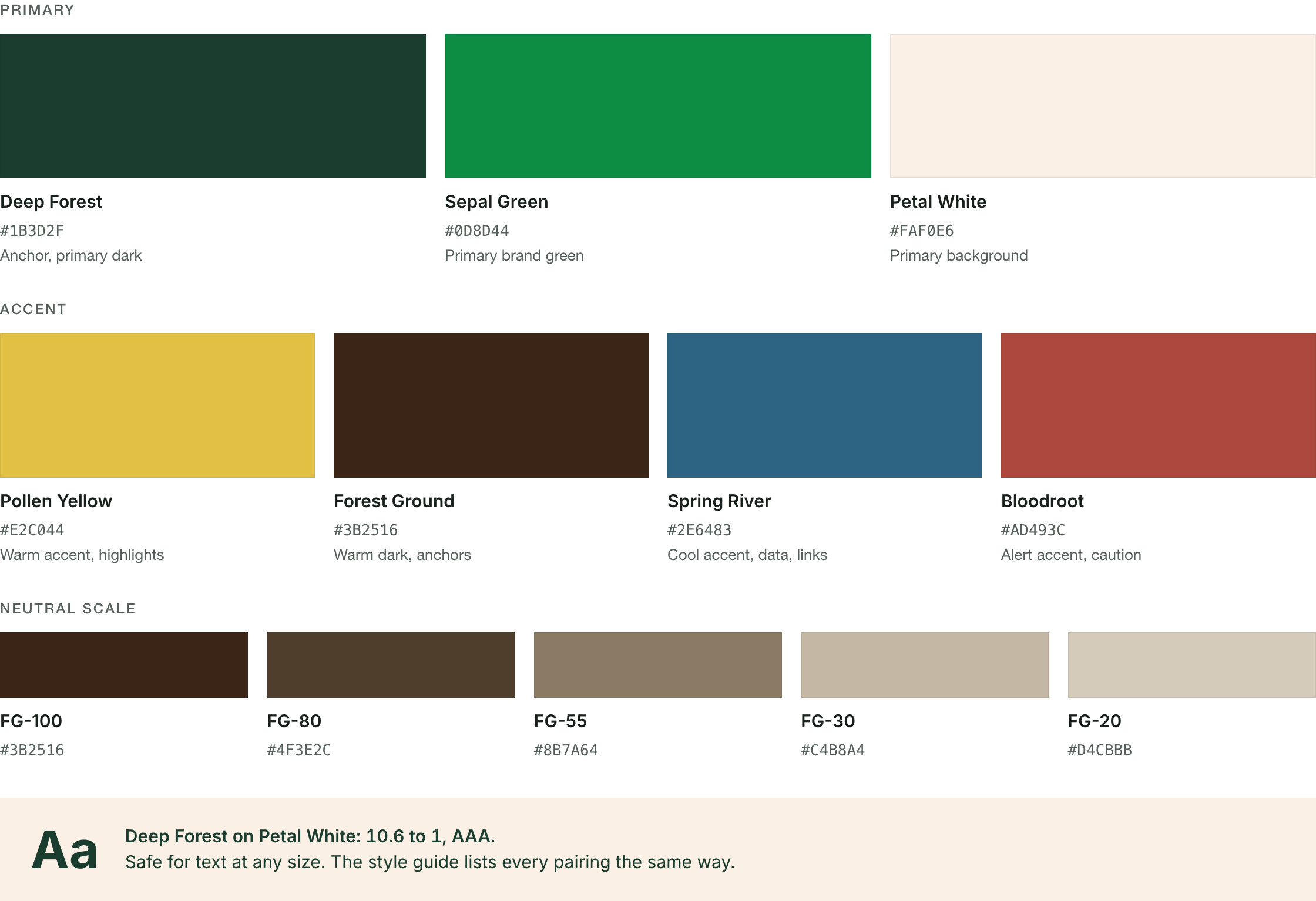
The partners wanted to signal environmental work without the clichés. The palette comes from Ohio's landscape: native plant greens, late-summer soil, river water. Nine named colors in three groups. Deep Forest anchors, Sepal Green leads, Petal White gives the work room.
Every text pairing was tested against WCAG contrast standards and written into the style guide. The team knows which combinations work for body text and which are for display only. Accessibility is part of the system, not a check at the end.
Type with reasons
Six typefaces became two
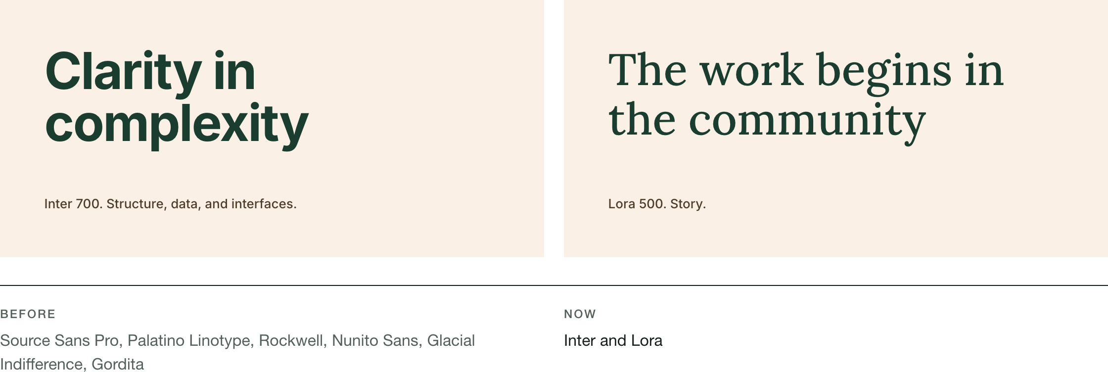
The old brand standards listed six typefaces across reports, slides, and Canva. The new system has two. Inter carries structure, data, and interfaces. Lora carries story. The pairing holds the same balance as the mark: analytical precision with human warmth.
Both are free and run in Google Workspace. A small team never pays for a license or fights a missing font to stay on brand.
Brand Extension, Part One
Designing for use
A logo and a style guide don't make a brand. People using it every week do. So the second phase asked a different question: what does this team need to produce on-brand work without calling a designer?
The answer was five deliverables, and all of them depended on one: the pattern.
Research into pattern
We went back to the plant
A trillium never grows alone. It depends on fungi to feed, ants to carry its seeds, and pollinators to reproduce. Its presence tells ecologists the whole forest is healthy.
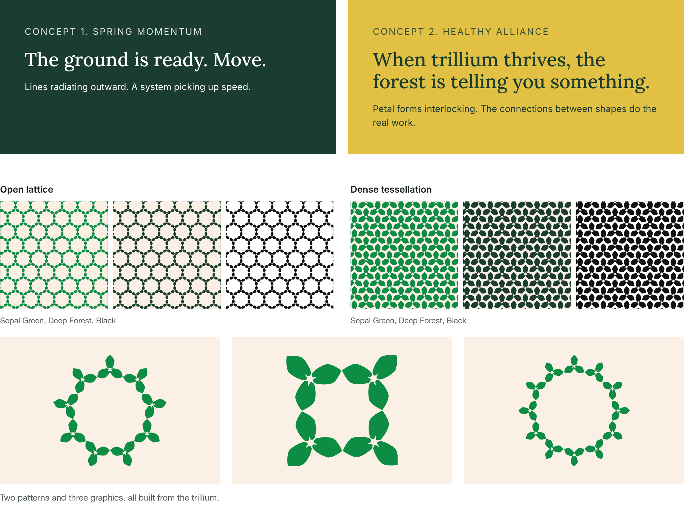
We presented two concepts built from that research. Spring Momentum: lines radiating outward, a system picking up speed. Healthy Alliance: petal forms interlocking, where the connections between shapes do the real work. Feedback from the team shaped the final system: two patterns made from the trillium itself, an open lattice and a dense tessellation, plus a set of rings and frames. Every piece comes in the brand colorways with tiling guidance.
The kit
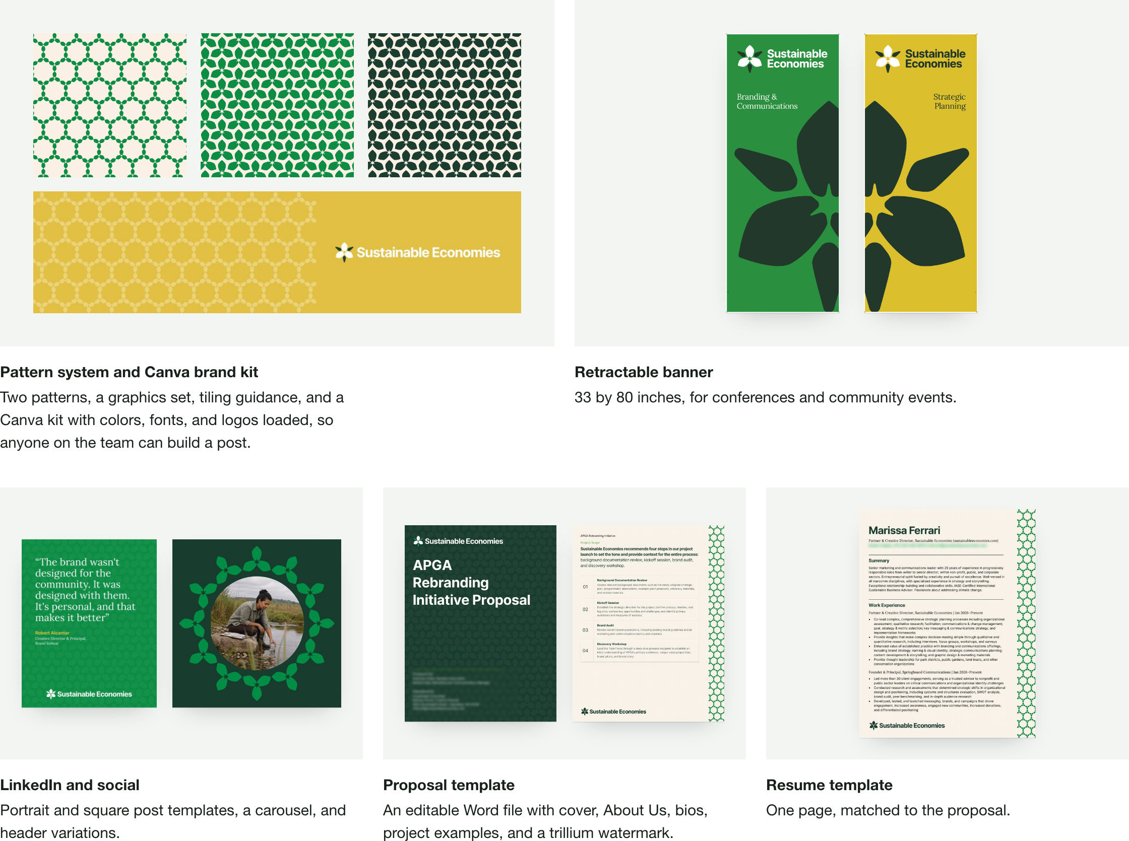
Five deliverables, each built for the people who use it
In use
The system goes to work
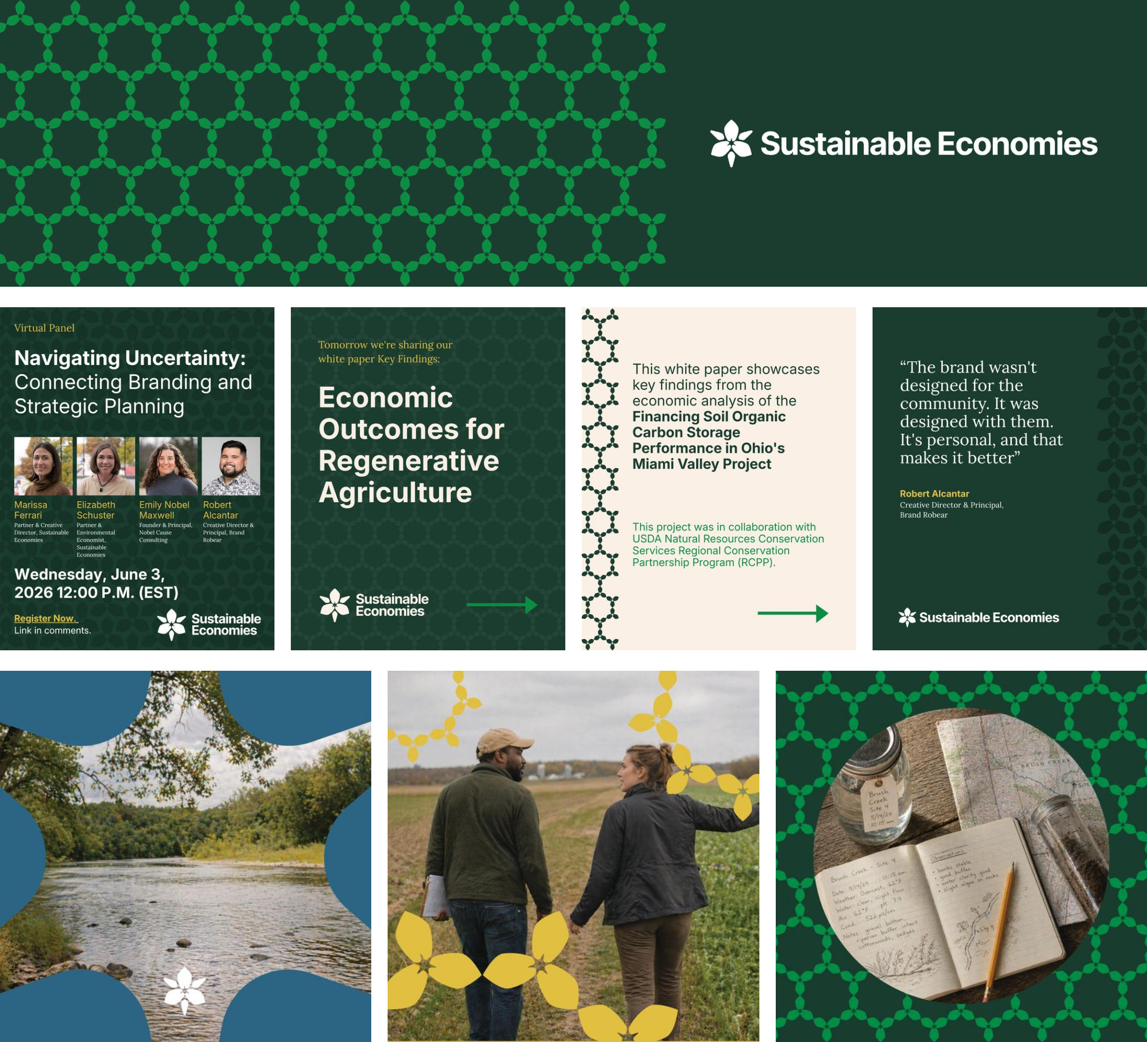
The system went live on Sustainable Economies' LinkedIn. One of its first jobs was promoting a June 3 virtual panel, "Navigating Uncertainty: Connecting Branding and Strategic Planning." Robear joined the panel alongside the Sustainable Economies team, talking about the same work this page shows.
What changed
A team that runs its own brand
The team builds its own LinkedIn posts in Canva, on brand, without a designer.
Proposals and resumes go out from one editable template.
The new firm shows up with one consistent identity, from a 32-pixel avatar to an 80-inch banner.
Brand Robear
Workshop facilitation, strategy, identity, design systems, templates, motion.