Grand River Network
The Grand River Network embarked on a comprehensive branding and marketing initiative to ensure that the river corridor's revitalization efforts are aligned with community values and centered on equity. The goal was to co-create a brand that resonates with the diverse voices of the community, fostering a sense of ownership and shared responsibility. Our work encompassed naming, brand strategy, messaging, visual identity, and the development of a detailed marketing strategy to guide future communications and engagement efforts.
Animated Logo
Background
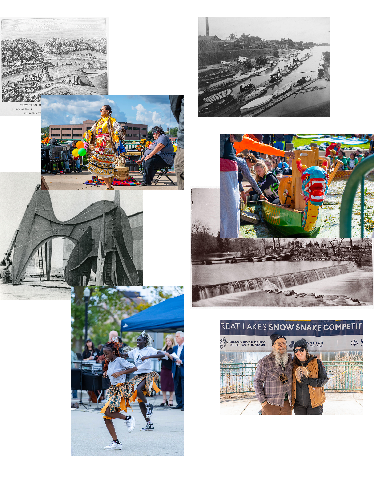
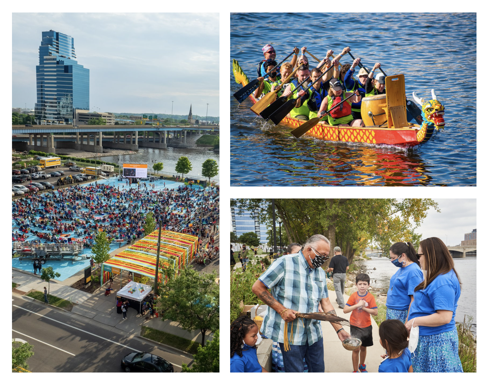
Grand Rapids has always been shaped by the Grand River, from its early role as a vital resource for the indigenous Anishinaabe people to its industrial era transformation. Now, the river is returning to its roots as a natural, community-centered space. To build on this momentum, the city is launching a new nonprofit to lead the charge in revitalizing the Grand River Corridor. This nonprofit will unite community voices and partners, creating a brand and strategy to showcase the river’s potential to inspire growth, prosperity, and a vibrant future for all of Grand Rapids.
The Challenge
One of the key challenges was navigating the community's diverse perspectives and interests. Balancing the need for economic development with preserving cultural and ecological integrity requires careful consideration. Creating a brand that could unify various stakeholders under a shared vision was essential for the project's success.
The Opportunity
Our project allowed us to engage in a comprehensive branding and marketing initiative. This involved naming, brand strategy, messaging, visual identity, and developing a detailed marketing strategy to ensure that the revitalization of the river corridor aligns with community values and focuses on equity. Our aim was to collaboratively create a brand that connects with the diverse voices in the community, fostering a sense of ownership and shared responsibility.
Strategy
Community-Based Design Approach
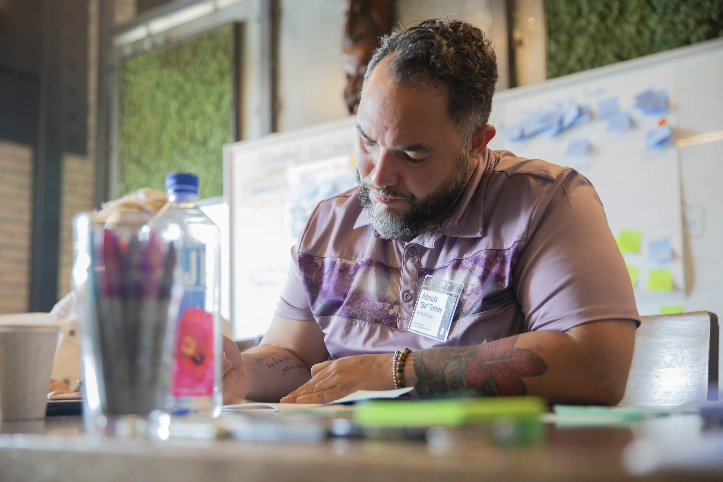
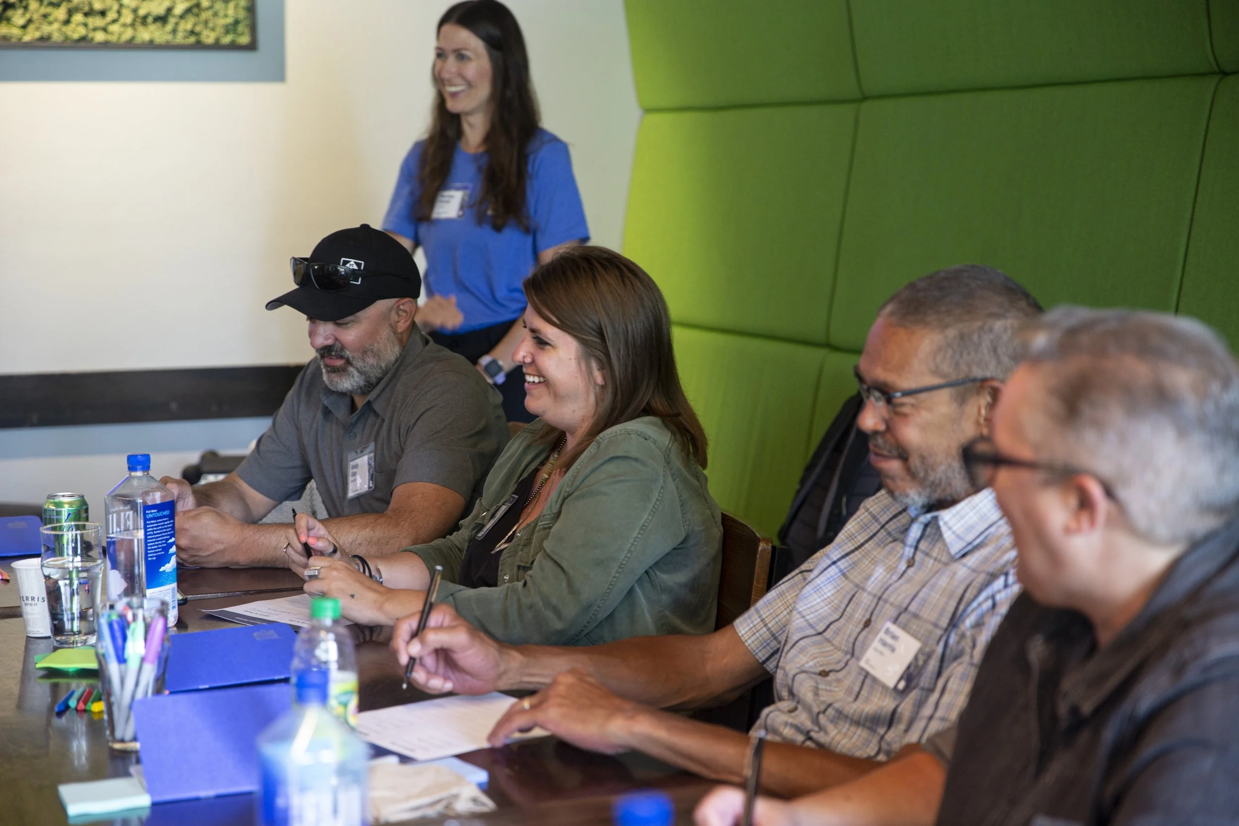
In tackling this project, we took a community-centric approach, prioritizing equity and inclusivity. We organized interactive workshops that involved diverse community members, gathering valuable insights and feedback that shaped the brand's development. These workshops played a crucial role in naming the organization, establishing our guiding principles, and ensuring the brand resonated with the community's values and dreams.

Naming the Organization
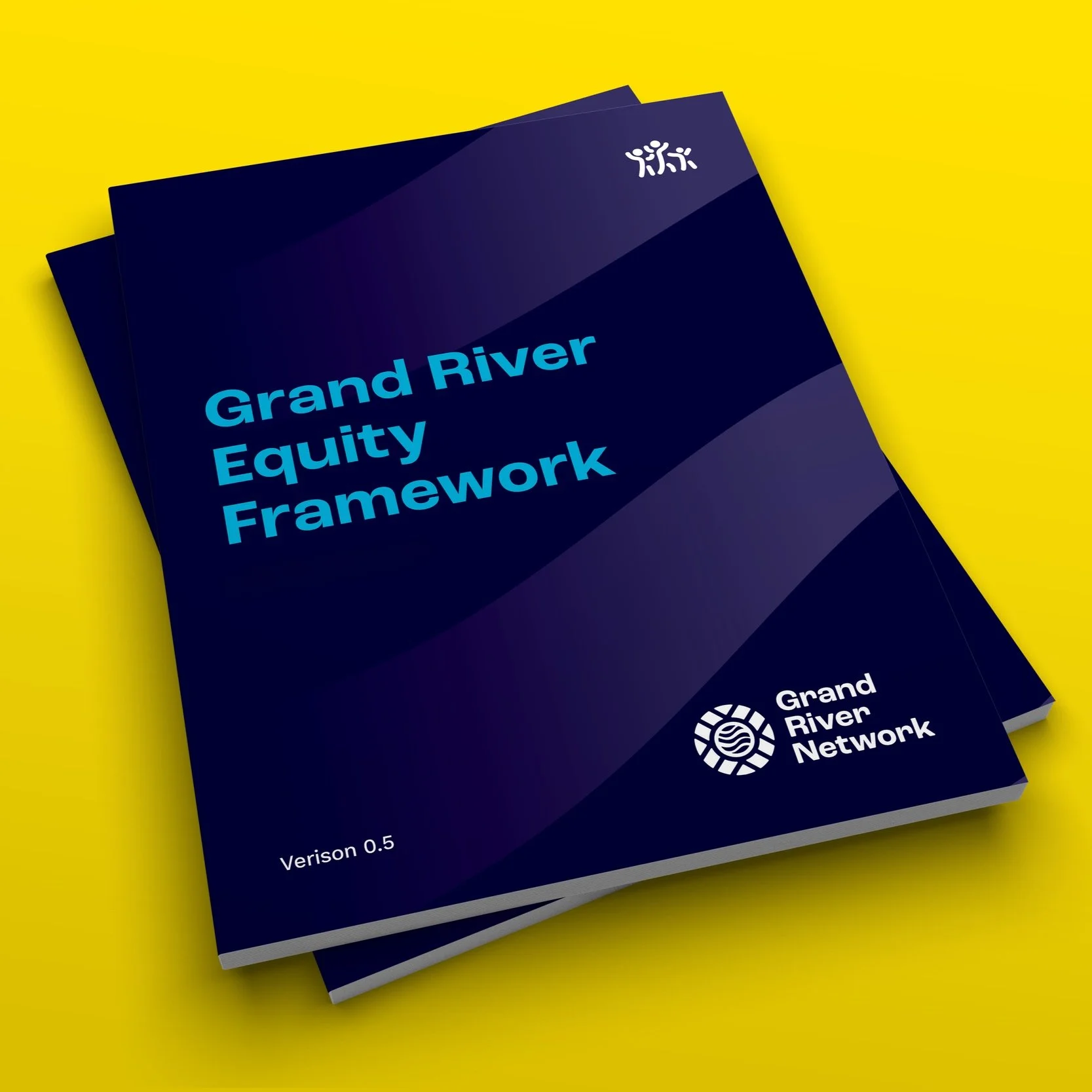
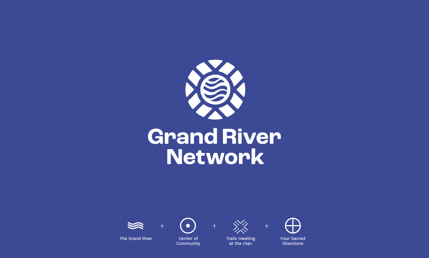
We conducted an in-depth naming process, which involved extensive research and workshops. The result was the name of our organization, “Grand River Network.” This name reflects our organization’s vital role as a bridge and caretaker of the river and its surrounding communities. Reports and workshop findings played a crucial role by synthesizing what we discovered from community members to ensure the name was clear, meaningful and representative of the community’s vision.
Verbal Identity
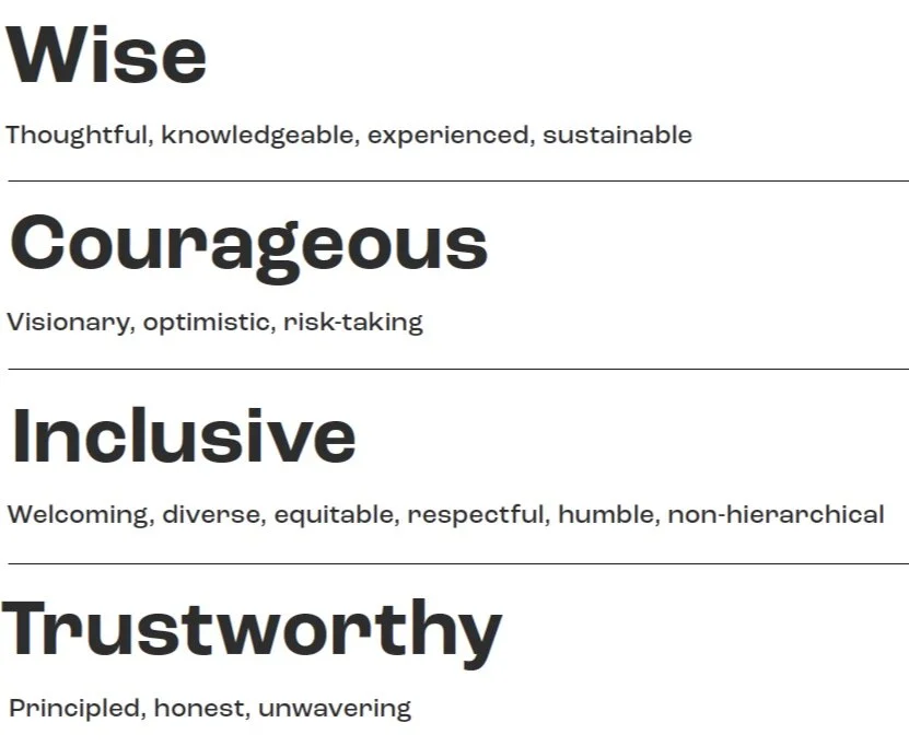
After many fruitful conversations and workshops with community leaders, council people and business owners, we landed on a core strategy statement.
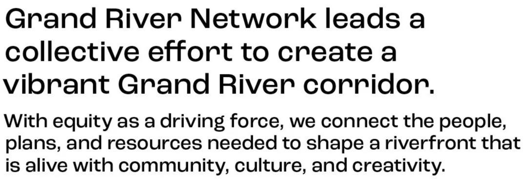
Messaging was crafted to reflect the organization's commitment to equity, community engagement, and the revitalization of the Grand River corridor.
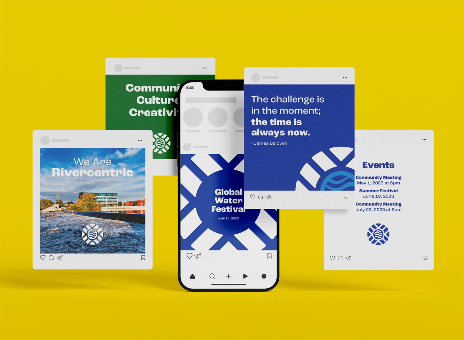
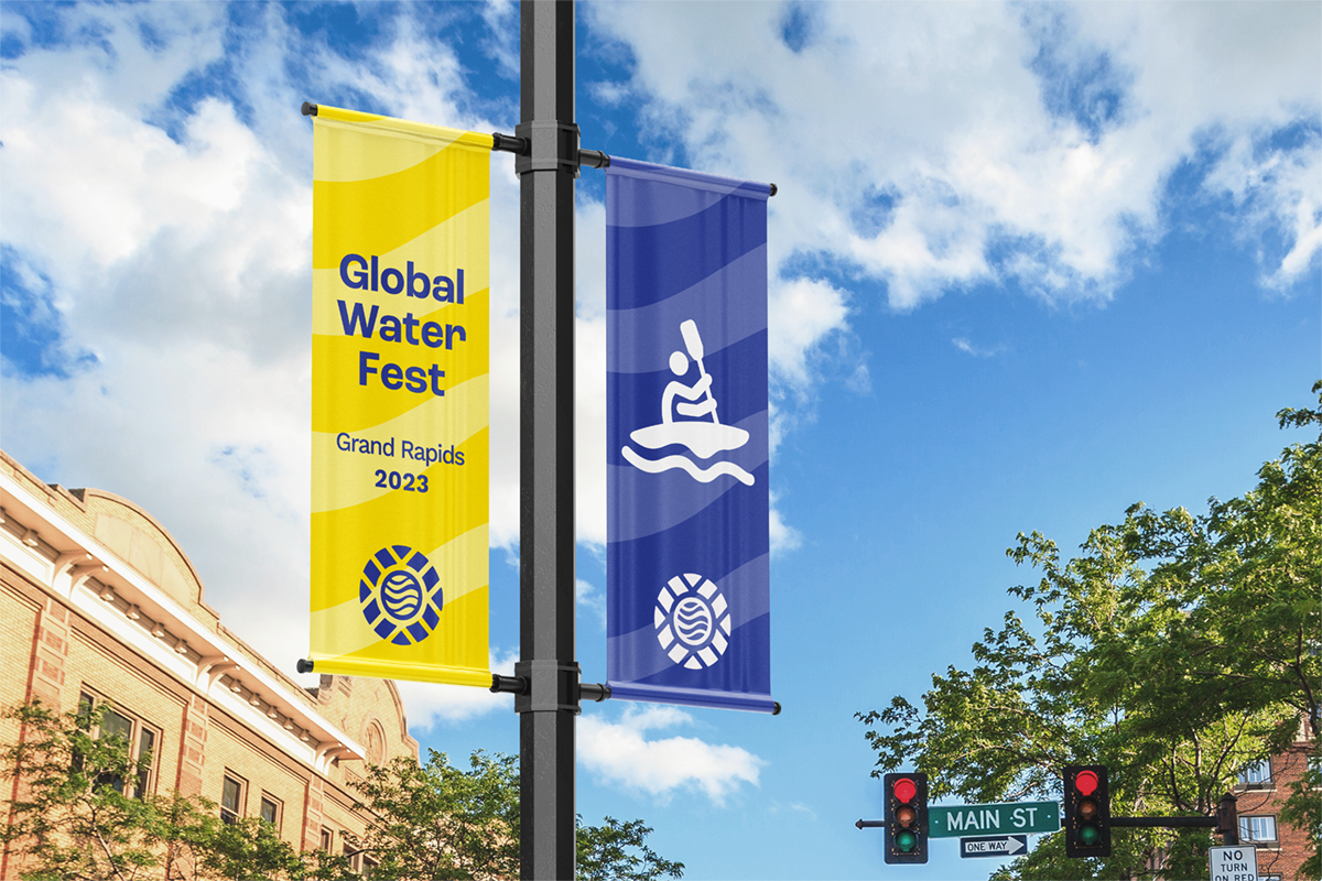
Visual Identity
The new logo for Grand River Network symbolizes the convergence of community, culture, and creativity. It incorporates elements that represent the river, the people, and the vibrant energy of the revitalization efforts. The logo serves as a visual anchor for all branding materials.
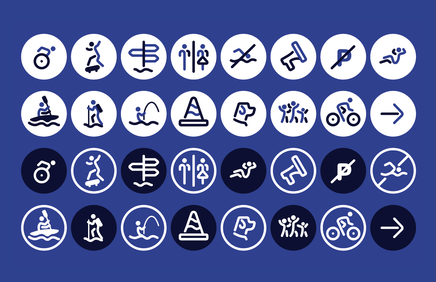
Iconography
A set of custom icons was created to represent various aspects of the Grand River Network's work, including community engagement, environmental stewardship, and cultural preservation. These icons are used across digital and print materials to reinforce the brand’s identity.
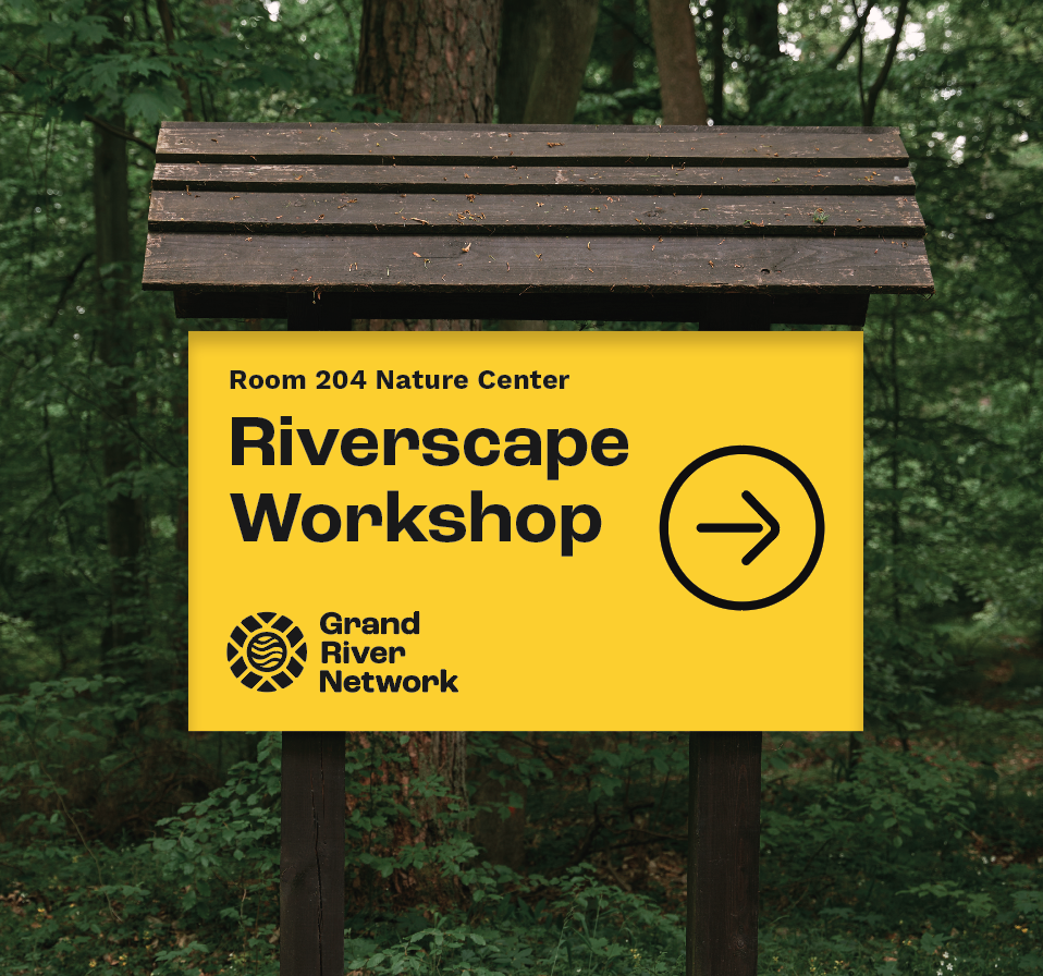
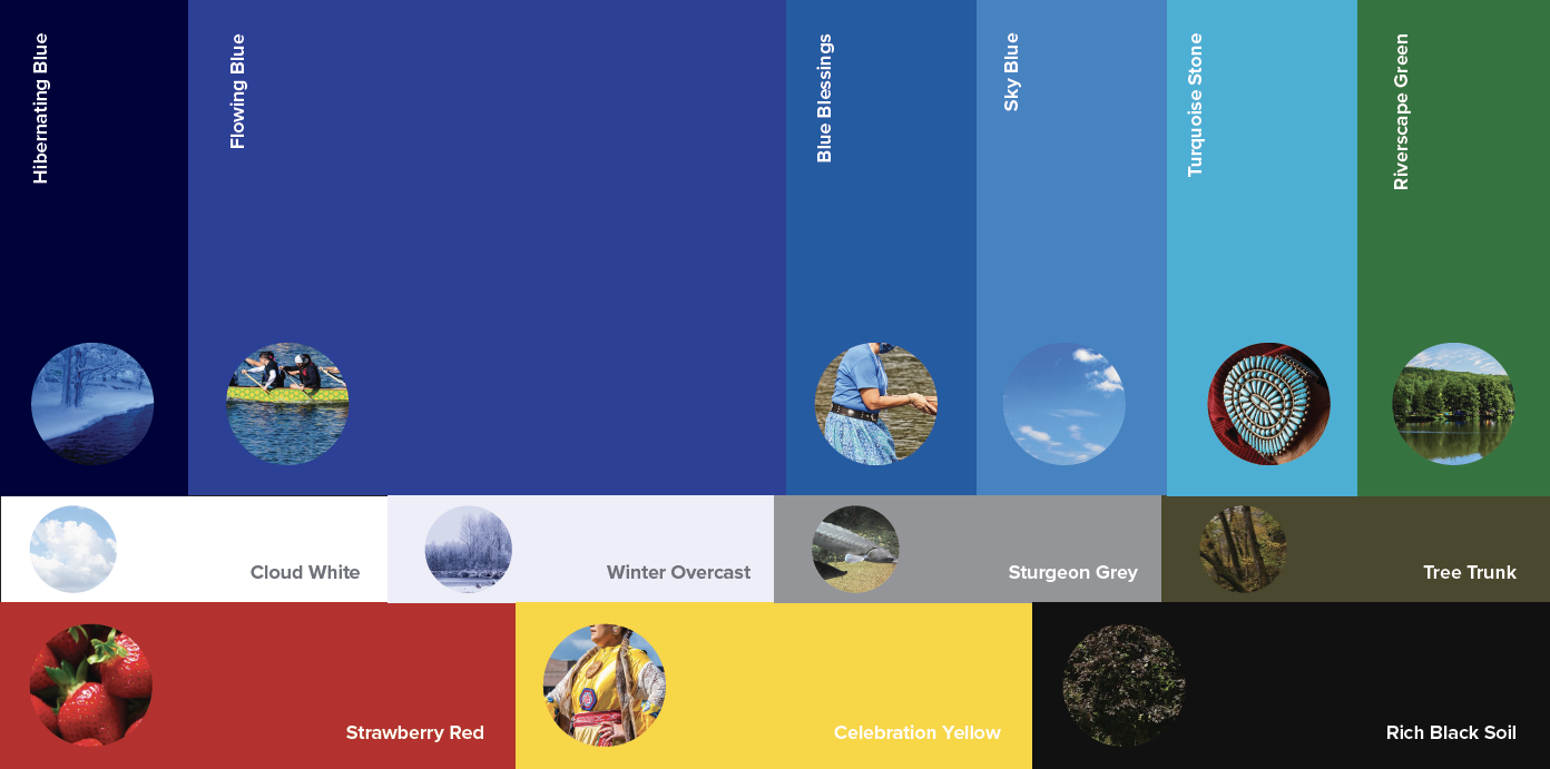
Abundance of Color
The vibrant color palette of the Grand River Network draws inspiration from the rich tapestry of nature and history, infusing the brand with warmth and vitality. Our carefully chosen colors reflect the world in which we operate and provide a wide range of accessibility- friendly combinations.
Start With Accessibility
When creating the Grand River Network, it was essential to prioritize accessibility and inclusion. During the brand development process, we carefully considered readability, clarity, contrast, layout, and photography. The outcome is an inherently accessible brand system, and ensuring ongoing, accessible communications will be a continuous commitment.