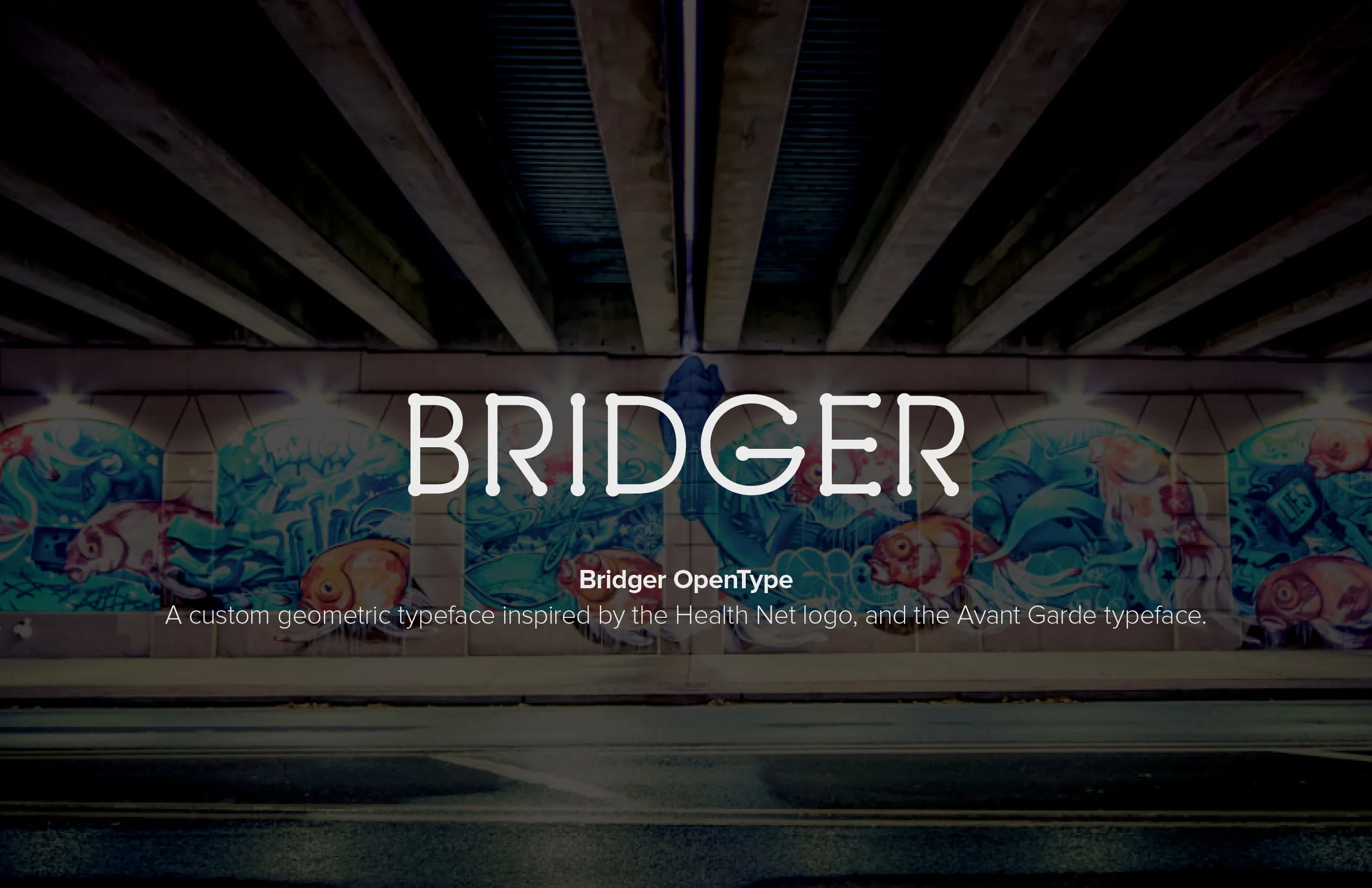
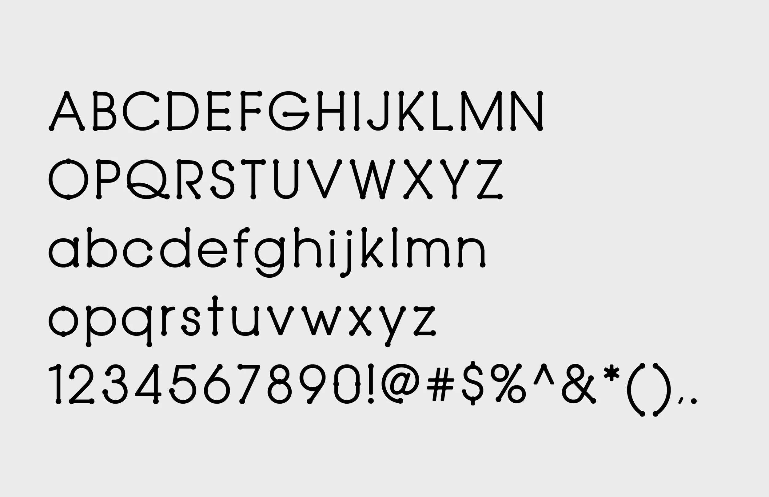
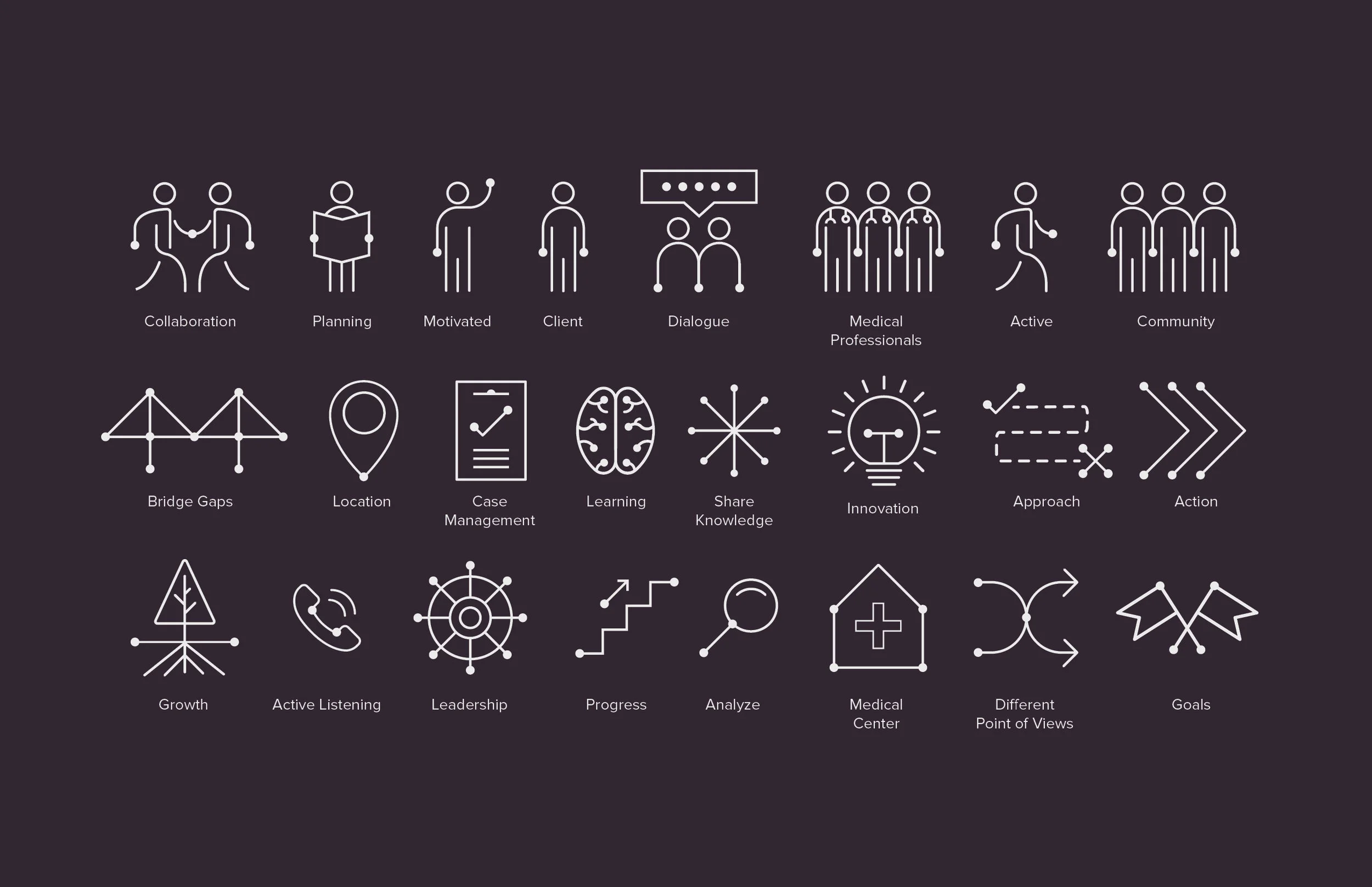
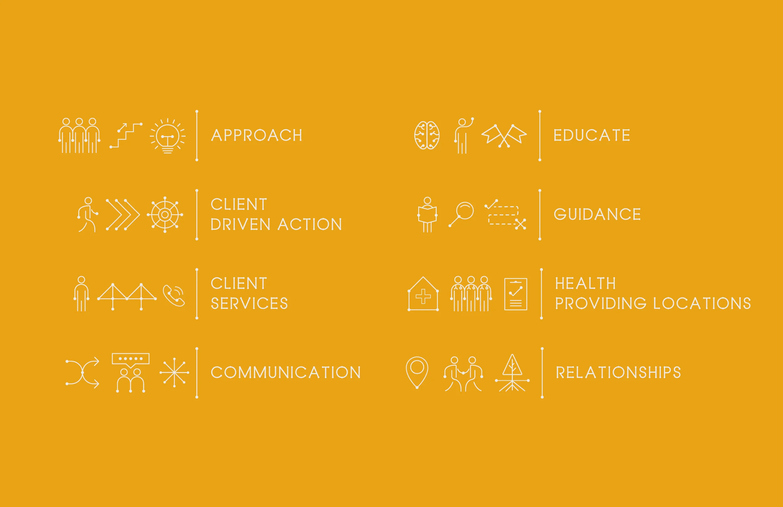
Health Net Typeface and Icon System
Health Net aimed to strengthen their brand presence and effectively launch their Community Impact Case Study. In response, we created a custom typeface and iconography that embody their dedication to community health and wellness. This design approach not only modernizes their visual identity but also aligns with their mission to foster healthier communities. The new elements are crafted to resonate with their community, providing a consistent and engaging representation of Health Net’s values and initiatives.